How I teach the meaning of (statistical) p-values
To understand p-values, you must discern a critical aspect: how confident you can interpret data. You must see how the relationship between the means and their data spread can vary, and how this affects your confidence in interpretation. This post is about getting students to discern the meaning of p-values.
I begin by drawing a representation of sampling. This is a key concept, but students are often familiar with it due to the exams they sit.
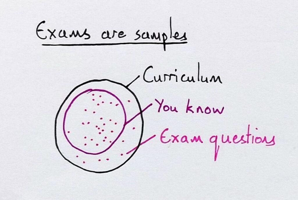
The largest circle represents all the information in a curriculum. The medium circle represents how much of this a student knows. The dots represent the knowledge that may be sampled on any individual test.
If you’re lucky, a test samples the part of the curriculum you know. If you’re unlucky, it’ll test everything you don’t know. Most of the time, it’s somewhere in between. I ask students if it’s better to have a larger or smaller sample (the dots) on an exam, and they agree that a larger sample is less risky. I point out that it’s also more reliable as a measure of what they know.
Next, I draw a bar chart representing two classes (studying the same course with the same teacher) and their test results. Both classes score 50% on average, and I ask the students if the classes are identical.
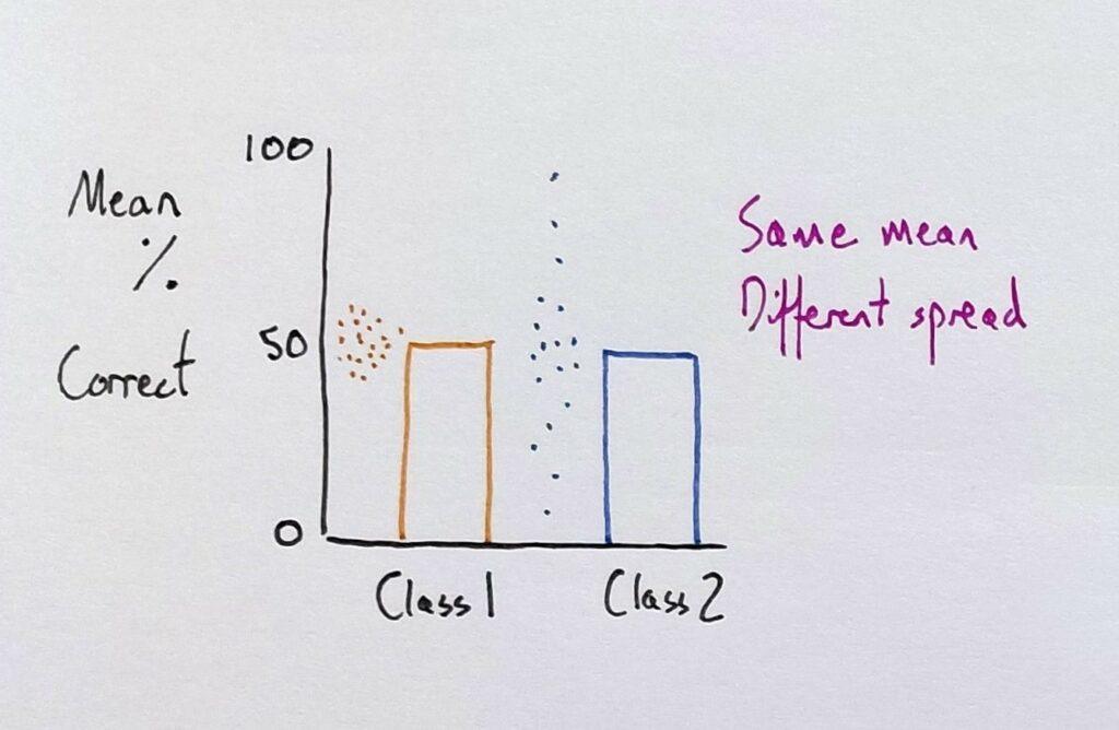
A principle of variation theory is identifying the aspect you want students to distinguish and then varying it. So, I varied the spread of data using dots to represent individual scores.
The scores of one class spread little from the mean, whereas the other’s spread further from their mean. This step has varied one thing. It has kept invariant the curriculum, the exam, and each class’ mean result; only the spread of results has varied. This, then, has brought it to the attention of the students.
I then draw a bar chart with identical axes, and I say to students that, in the same course, two other classes got these results:
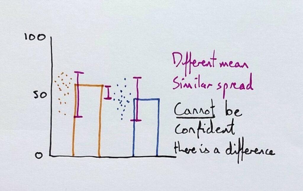
Now the means are different, and I draw dots to show a similar spread of results. As the means vary but the spread doesn’t (much), it is brought to the students’ attention (forgive the range bars here instead of standard deviation bars). I ask the students if the classes are different: does one class know more than the other?
To help them here, I ask whether one class would always come out better if I gave them five more tests to complete.
Crucially, I ask them how confident they would be in making the prediction. This is key to understanding p-values, as “p” refers to probability. The students typically agree that they couldn’t be so confident that they’d keep getting the same difference between the classes in other tests. Therefore, the classes could be similar in overall knowledge.
I then draw another bar chart with identical axes.
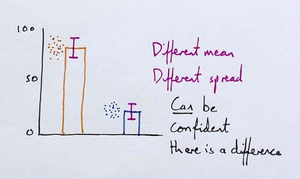
This time, both the mean and the spread vary. The means represent 80% correct for one class and just 20% for the other. And each class’s individual results don’t overlap; far from it.
I then repeat the question to the student: how confident are they that the two classes are different in overall knowledge? I ask what would happen if I gave them five more tests. The students typically express confidence in their prediction.
Next, I give students a heuristic for interpreting graphs with error bars.
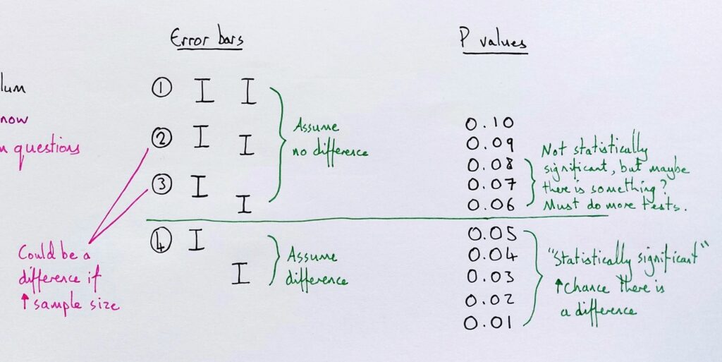
I draw the error bar examples (on the left) one by one and ask students whether they would assume that it was a real difference.
The rule of thumb I give is to assume a difference if the error bars do not overlap at all, but to remember that this is an assumption only. In fact, some would give a stricter rule.
I also give them the exception that error bars may overlap and still represent a difference when the sample size is very large. With this, they should seek better verification of how confident they can feel.
Here, then, I introduce the idea of the p-value and tell them that many different statistical tests will give a p-value: a number that indicates a statistical level of confidence. Not a magnitude of difference, but a level of confidence you can assume that there is an actual difference (large or small).
Finally, I discuss the emergent problems when scientific journals prefer to publish papers with p-values below 0.05. This incentivises “p-hacking”. Learn more about coordinating meanings with students in my book Teaching Meaning.